Gridded Ooze
Contributor
-ish
In the iconic episode “The Pink Phink”,1 Pink Panther disagrees with the decorator on what color the house should be. Almost caught sabotaging the decorators’ work, Pink Panther leaps into a pink wall and disappears as if he’s completely camouflaged. Pink Panther is not rendered with tones of light, shadow, or fur. Such details would have revealed his 3d form contrasted against the slick surface of the freshly painted wall. Instead, between two frames, Pink Panther’s form is simply outlined, and then it is not. Our natural desire to register objects allows us to quickly adjust to the impossible transformation of a solid wall into occupiable “pink-space.”
Mark Rakatansky celebrates that “animation allows for elastic play when given limits of physical identity already established that is temporarily elongated, extended, in comparison to that limit.”2 He goes on to deconstruct how Bugs Bunny can run and stretch into a dynamic range of poses, but still maintains his Bugs Bunny-ness by sticking to some rules of zoological anatomy and his defining characteristics baked into the original looney tunes model sheet.3
- His arm is the thickest at the wrist.
- Neck should always be short.
- Ruff on his cheeks should be high.
- Etc.
This brings to mind the skeuomorphic4 icons of our digital interfaces that extend our sense of physical objects within a digital space. It feels perfectly natural to click and drag a pdf into a folder or to jot a note down on a digital Post-It, knowing full well that the interface bears no true likeness to the physical objects they depict. A desktop folder is a folder, as much as Bugs Bunny is a rabbit, and Pink Panther’s wall is solid (sometimes). While our current technology makes realism ever easier to achieve, delving into the territory of realistic-ish invites a reevaluation of how artists have historically dealt with ambiguous objects within imagery.
The 18th-century artist, Johann Nilson, presents us with an even more subtle play of physical identities. At first, a heavily ornamented coffee house sits within a graphically illustrated frame.5 A second glance and you notice something strange. The pictorial frame bleeds into the scene to form a strange facade for the coffee house. It re-frames windows and doors similarly but not quite like overgrown vines. The flag atop the building disregards its pictorial boundaries entirely, and proudly juts out beyond the frame. It is unclear which edges articulate ground, foliage, or architecture, and which lines are just graphic ornamentations that frame the view on the page. The print is in fact proto-digital in how we experience text, image, and “3-dimensional” space, compressed within multiple windows on a single “2-dimensional” plane. I do not intend to romanticize the illusionary effects made possible by ink, but would like to consider how any media used to depict an object can stretch or augment its characteristics. For instance, what would be the Bugs Bunny instruction model sheet equivalent of a frame depicted in ink?
- The frame must form a continuous edge (as a line or hatch), so that the eye can distinguish between pictorial space and paper space.
- When objects pass behind the frame, mask them when they reach the other side.
- Sometimes break the frame line, but only if you can still register rules 1 and 2.
The realistic-ish frame is familiar to us, yet adopts novel behaviors within the reality of an image. Consider how this historical drawing might inform a new reading of contemporary mediums like a Frame Animation, a Skeuomorphic user interface, or even a Hyper-Real Fluid Simulation.
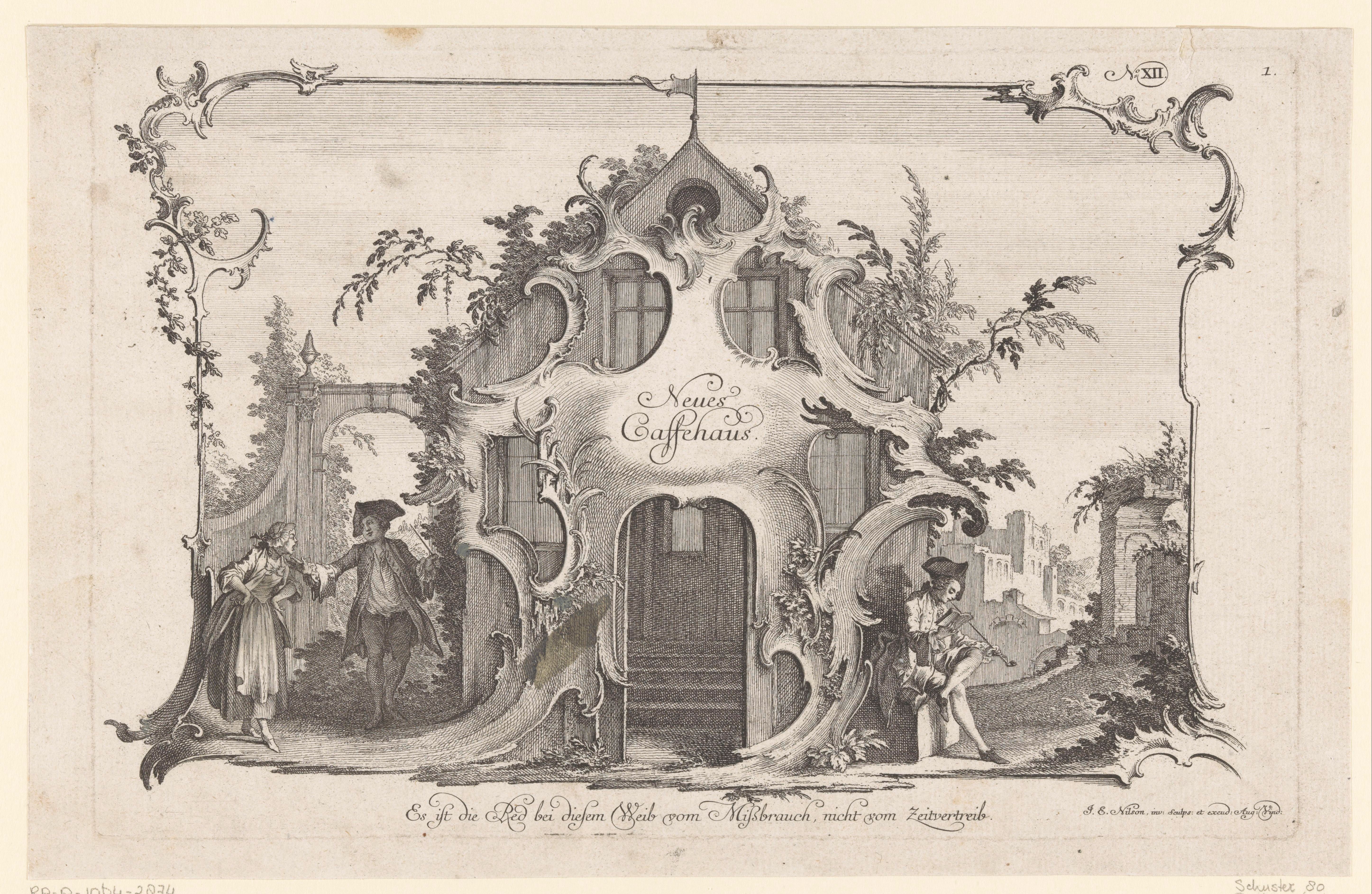
6 Coffee House with Bickering Couple, by Johann Nilson
Ooziness can be achieved with computational procedures intended to simulate the hyper-real movement of fluids. Not an uninteresting way to generate a 3d surface, but the technical process of replicating real-world behaviors is not of critical interest here. It’s when ooze behaves in unexpected ways that it invites a second glance. First, some limits need to be established.
- Ooze congeals when it’s thick and separates into droplets when thin.
- Translucent Ooze is different from glass, it should have a distorting effect on its context when looked through, and a slick sheen for added realism.
- Gridded Ooze7 does not need a visible container to hold its shape.
- Gridded Ooze has a surface like any other 3d model and can hold a texture map.
When the animation begins, Gridded Ooze appears to gush against surfaces that aren’t there. In fact, the ooze could be shaping itself to the cropping of the camera view, a moment where the composition of the image has as much influence over the form as laws of fluid dynamics. A perfectly checkered grid paints the liquid-y surface, which could be believable when you view a frozen still image. However, once the ooze is in motion, the checkered grid does not distort and mix into a homogenous brown color as expected, it’s fixed in place, like a pixelated glitch on the screen. Similar to Nilson’s frame, that is both a graphical ornament and architectural element, the checkered grid is both painted onto the fluid, and a distinct layer (in the Photoshop sense) that does not truly acknowledge the presence of the fluid. Fluid can do almost anything, it does not resist transformation, but for this very reason, it requires close attention, to make meaningful interventions that negotiate between its physical identity, and its digital reality.
To be nimble in our encounters with digital objects, we do not reject realism, instead, we open up to unexpected hybridities between our physical and digital existence. A preference for realistic-ish means to interrogate objects as they exist relative to digital imagery and to reflect our need to have some sense of physical identity to register differences. It delights in unexpected collisions of possible and impossible through a play of rendered surfaces, colors, and lines. Walls transforming into “pink-space”, frames simultaneously being what they frame, and fluids mixed with grids. Each example differs in time, discipline, and medium, but they present alternative frameworks for a more ambiguous, less easily categorized vision of reality.
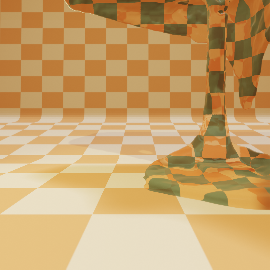
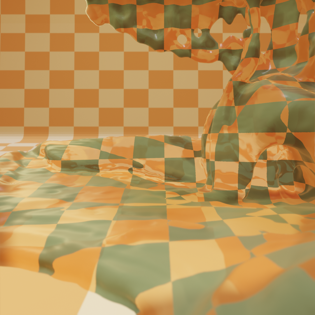
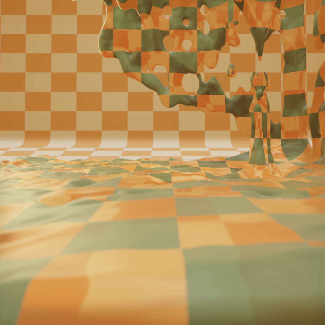
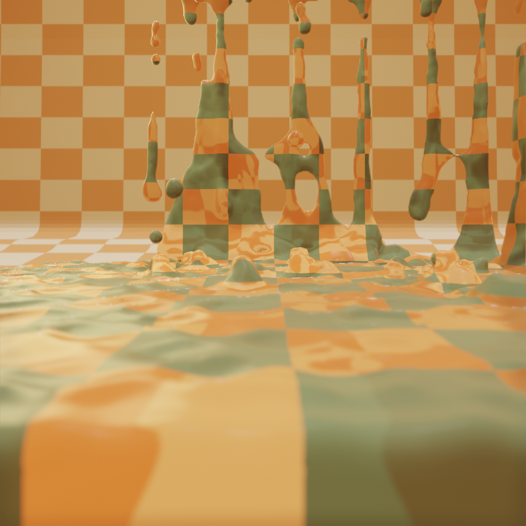
8 Still frames from the Animation, Gridded Ooze, by Julie Kress. See at https://vimeo.com/388572260
- Pink Panther, season 1, episode 1, “The Pink Phink”, directed by Friz Freleng; Hawley Pratt, aired December 18th, 1964, on NBC, https://www.youtube.com/watch?v=41aGCrXM20E&feature=emb_logo&ab_channel=OfficialPinkPanther ↩︎
- Mark Rakatansky, Tectonic Acts of Design and Doubt (London, UK: Architectural Association Publications, 2012), 184. ↩︎
- Bob McKimson,Bugs Bunny Model Sheet. 1943.Warner Bros. Cartoons Inc, Accessed Feb 15, 2021, https://www.iamag.co/looney-tunes-50-original-model-sheets/ ↩︎
- A skeuomorph is a graphic representation of a physical object, like the recycling bin icon. ↩︎
- Initially referenced by Harries, “The Broken Frame”, 67. Image: Johann Esaias Nilson, 1756 ↩︎
- Johann Esaias Nilson, Koffiehuis met ruziënd paar (Coffee House with Bickering Couple), between 1731 and 1788, Engraving Print on paper, https://commons.wikimedia.org/wiki/File:Koffiehuis_met_ruzi%C3%ABnd_paar_Neues_Caffehaus_(titel_op_object)_Sociaal_vermaak_(serietitel),_RP-P-1964-2874.jpg ↩︎
-
Kress, Julie. Gridded Ooze. 2019. https://vimeo.com/388572260
Also see Gridded Ooze Top View. https://vimeo.com/388572811 ↩︎ - Still frames from the animation, Gridded Ooze. ↩︎