RGB vs. CMYK or A Primer on Color in the Age of Digital Reproduction
Contributors
Color
When Alberti drafted On Painting in 1453, he understood that the constraint of a limited palette of colors could be a valuable tool for an artist: “Some people express astonishment that the ancient painters Polygnotus and Timanthes used only four colours, while Aglaophon took pleasure in one alone… as if these people believed it the duty of an excellent artist to employ the entire range of colors.”[1] Today we employ a different palette of sorts, the RGB colors of digital design tools and their CMYK print equivalents. Our ability to manipulate digital colors and accurately transform them into ink on the printed page is something we take for granted, but in reality our designs are governed and indirectly shaped by the technical systems which underpin digital representations of color.
In the interest of establishing a common vocabulary, we must first revisit some key terms and concepts. Color is a subjective quality of visual perception and a phenomenological experience that allows our brains to interpret a range of electromagnetic wavelengths that comprise the visible light spectrum, from 380nm to 740nm. Crucially, the full gamut of colors we can perceive includes not just the colors of individual wavelengths of
light (pure colors, e.g. ROYGBIV), but also the colors formed by the combined energy of many wavelengths of light. Most colors in the real world, in fact, are mixtures of various wavelengths and are thus best represented as continuous graphs of energy across the visible spectrum. You can see an example of one such graph, or spectral power distribution, in the diagram below, depicting a halogen light bulb. Although halogen light contains radiation from many wavelengths, the skew towards the long end of the spectrum accounts for its characteristic warm, yellowish color.
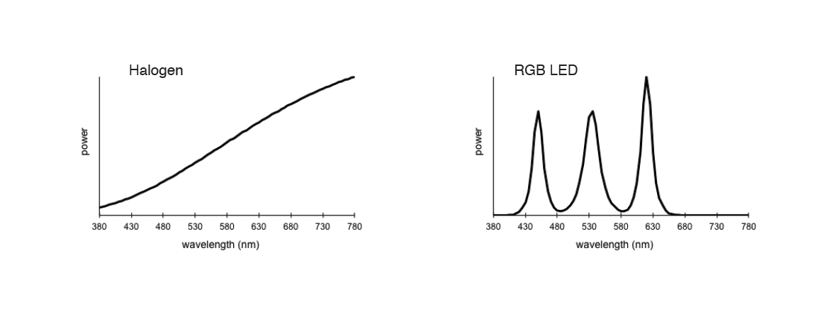
Spectral power distributions of halogen light and RGB LED white light
It turns out that our eyes are rather imperfect measuring machines. There are only three types of color-sensitive cones in the retina: “reddish” detectors, “greenish” detectors, and “blueish” detectors. Together they determine the relative combined energy of wavelengths in three overlapping bands of the spectrum which the brain in turn interprets as a color. This reductive process has a number of inherent consequences. Most importantly, it allows for the misperception of certain colors as matching, even if the colors may have different underlying spectral power distributions, a phenomenon known as metamerism. This phenomenon allows for a relatively simple model of encoding colors as quantifiable values. For any color—represented by a nuanced, continuous spectral power distribution— we can produce a perceptually matching color composed of a mixture of just three wavelengths: a pure red, a pure green, and a pure blue. In other words, any full-spectrum color in the real world has an indistinguishable RGB equivalent (for some ideal set of red, green, and blue lights).
This foray into color science serves to emphasize three points:
- The RGB encoding model is completely contingent on the specific biology of the human eye.
- The RGB encoding model is insufficient to describe colors and their interactions in nature outside the realm of human perception.
- Producing an accurate RGB color relies on the ability to emit relatively pure colors which was more or less impossible before the advent of lasers and light-emitting diodes (LED)—and is still impossible when considering almost any medium other than the screen.
Let’s move from the general to the specific. Assume we want to represent the color paprika. What does it mean to say that the color has an RGB value of (235, 92, 40)? Unfortunately, very little. The fact that many RGB colors are given as values between 0 and 255 obscures the fact that they really represent the intensity of three RGB lights. It is more helpful to say that the color has a value of (235/255, 92/255, 40/255) or (0.92, 0.36, 0.15). So our Paprika color relies on a 0.92 intensity of red light, a 0.36 intensity of green light, and a 0.15 intensity of blue light. But what lights are we talking about exactly? An RGB value is completely meaningless without specifying the color of each pure RGB primary. To uniquely identify our paprika color from another paprika-ish color, we must further say that our RGB values are relative to a known set of primaries, for example, three primary colors documented by an agreed upon specification. Of course, to go further down the rabbit hole, since colors can look different when viewed under different ambient lights, we need to specify a theoretical light source, for example Standard Illuminant D65, roughly equivalent to the average midday light in Western Europe, and an electro-optical transfer function, which maps the range of intensity values 0 to 1 to actual amounts of linear light. Since it would be crazy to qualify every RGB color with all of this extra information, we rely on color spaces to convey the context necessary to translate a set of three values to a unique and unambiguous color. The sRGB color space, for example, specifies the ITU-R BT.709 primaries, the standard illuminant D65, and a transfer function similar to a 2.2 power law (ylinear light = xdata value^2.2).[2] Different color spaces help us describe colors on different screens with varying gamuts and translate colors across programs, devices, and contexts. sRGB is the default color space of many programs, almost all images on the web, and the implied color space when none is specified. While (0.92, 0.36, 0.15) is more or less meaningless, (0.92, 0.36, 0.15) in the sRGB color space allows us to pinpoint our exact color of paprika in all of its vibrant orange glory.
Of course, when we go to print the (0.92, 0.36, 0.15) sRGB color, it’s even harder to guarantee the correct output. Why is this? Why do so many printed colors look like dull versions of their digital counterparts? While RGB color is emitted directly as light, printed color relies on ink reducing the white light that would otherwise be reflected by the surface of a medium. So at best, a printed color can only be as bright or vibrant as the white ground of the paper upon which it is printed. Even glossy paper, to say nothing of the dull gray of newsprint, reflects much less light than a screen emits. Beyond the shift from emitted light (additive color) to reflected light (subtractive color), printing an RGB color requires a conversion from red, green, and blue primaries to the primary colors of most color printing processes: cyan, magenta, and yellow. Mixing colors with cyan (C), magenta (M), and yellow (Y) is inherently limited and produces a smaller gamut of possible colors than most RGB color spaces. Adding black ink or a key plate (K) extends the gamut slightly, allowing for deeper, less muddy dark colors. However, light and saturated colors often cannot be created with CMY or CMYK.
There’s another problem, too. Conversion from RGB to CMYK depends on knowing the exact color space of the RGB input and the exact color space of the desired CMYK output. Since CMYK is destined for printing, CMYK color spaces represent the digital equivalents of real-life paper and ink combinations. When we save a file as CMYK we are implicitly (whether the computer program tells us or not) choosing a specific paper/ink combo, usually U.S. Web Coated (SWOP) V2 which assumes a commercial high-end web offset printing press and coated paper. If you print a CMYK SWOP file on an inkjet printer with glossy paper, the printer will internally convert once again from CMYK SWOP to its own CMYK variant which will produce similar colors when viewed on glossy paper. Unfortunately, between the moment that you send a file with CMYK (or RGB) colors to the printer and the moment that the ink hits the page, your file may pass through any number of intermediate programs (e.g. PDF conversion, pre-printing optimization programs, printer-management software, compression utilities, etc.). If any one of those programs forgets to pass along the exact color space of your input file, assumes a default color space, or—even worse—assigns a new color space without converting colors accordingly, all bets are off. This isn’t a theoretical concern, either—in practice it is almost impossible to fully ensure that your entire chain of production, from original design program to printer is completely color managed.
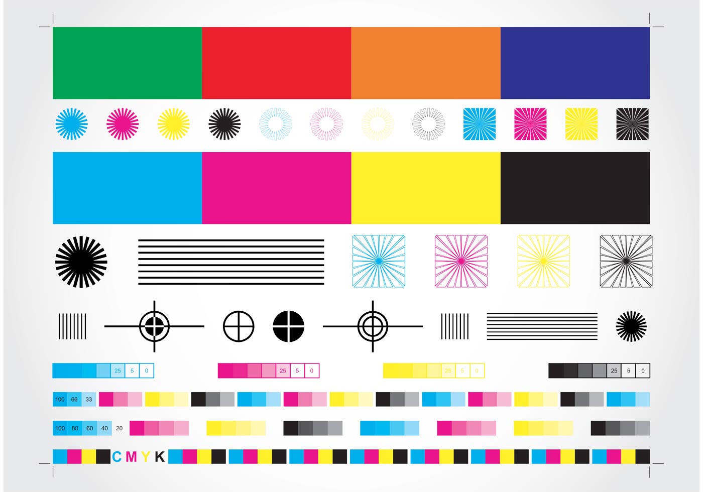
A printer CMYK color calibration chart
Given the pitfalls of working with digital color across different software programs and the inevitable lack of fidelity of printing, how should you make sense of the complexity of managing color? It is helpful to start at the end of the process, by envisioning the physical print you hope to achieve. Many printers have a diagnostic setting which prints a calibration page showing all possible colors. Working with an independent print shop presents additional options. Many printers can expand traditional CMYK colors with added spot colors, special inks mixed just for your print run. The online Color Library at https://colorlibrary.ch/ shows RGB input photographs transformed with a variety of creative printing profiles, from two-color neon profiles to three-color risograph separations. Rather than a limitation, the reduced color palette of the printer can be an exciting opportunity to achieve a unique print style that underscores the intention of your design.

Color Library (https://colorlibrary.ch), automated color separation
Once you know the capabilities of your printer, it is only a matter of working backwards to find the correct starting colors. First you identify the color space your printer expects or supports. Then you ensure that your printing software passes along this color space correctly from your original design file. For some printers, it may be best to send an unconverted sRGB file. Others may expect a file converted to a particular CMYK profile. In either case, achieving the correct result involves a back-and-forth process of testing printed colors and comparing them to the digital source material, along with a careful eye for detail. This is a process which rewards scrupulous digital practices and a habit of second-guessing every link in the digital-to-print chain.
In researching this piece, we came across an interesting conversation between Carolyn L. Kane & Zeina Koreitem published under the title, “Computational Color,” in Project, Issue 7. In their exchange, Kane re-introduces Heidegger’s idea of “technological enframing” as a way of understanding how contemporary digital art and design practices produce works involving color. She states that Heidegger “had in mind a condition where technology and production processes become so advanced and specialized, that what is or could be produced through the system would be increasingly divorced from the nuances of what phenomenologists call the ‘lifeworld’ […] it was initially selected from.”[3] Kane reframes the fundamental issue that divorces digital colors from the colors of the printed page: “Part of the problem with color is that, depending on which field or discipline you’re in, you approach it differently. For some, color is always technical, a series of codes and chemical formulas. For others, color is poetic and mysterious. It’s not that one [approach] is right and one is wrong. They depend on one another to develop, fail, and innovate all
over again.”[4]
Kane’s reformulation of Heidegger is an apt analogy for how one should approach working between RGB, CMYK, and the printed page: as a process that relies on continual innovation and a back-and-forth, push-and-pull between the advantages andpossibilities of digital color and the necessary con straints of physical media. You may never fully replicate the paprika color on your screen with ink on a page of newsprint, but the process of trying, failing, and getting closer ultimately reveals important truths about how we work with color as designers and links us to a broader history of artists, scientists, printers, alchemists, and philosophers grappling with how to use the full spectrum of visible light as a tool for expression and thought.
- Leon Battista Alberti, On Painting (London: Penguin, 2005), 82.
- See Troy Sobotka’s irreverent, but highly useful “Hitchhiker’s Guide to Digital Color” for a full understanding of RGB color space nuances at https://hg2dc.com/.
- Carolyn L. Kane and Zeina Koreitem, “Computational Color,” Project, Issue 7 (2018): 78.
- Ibid., 79.