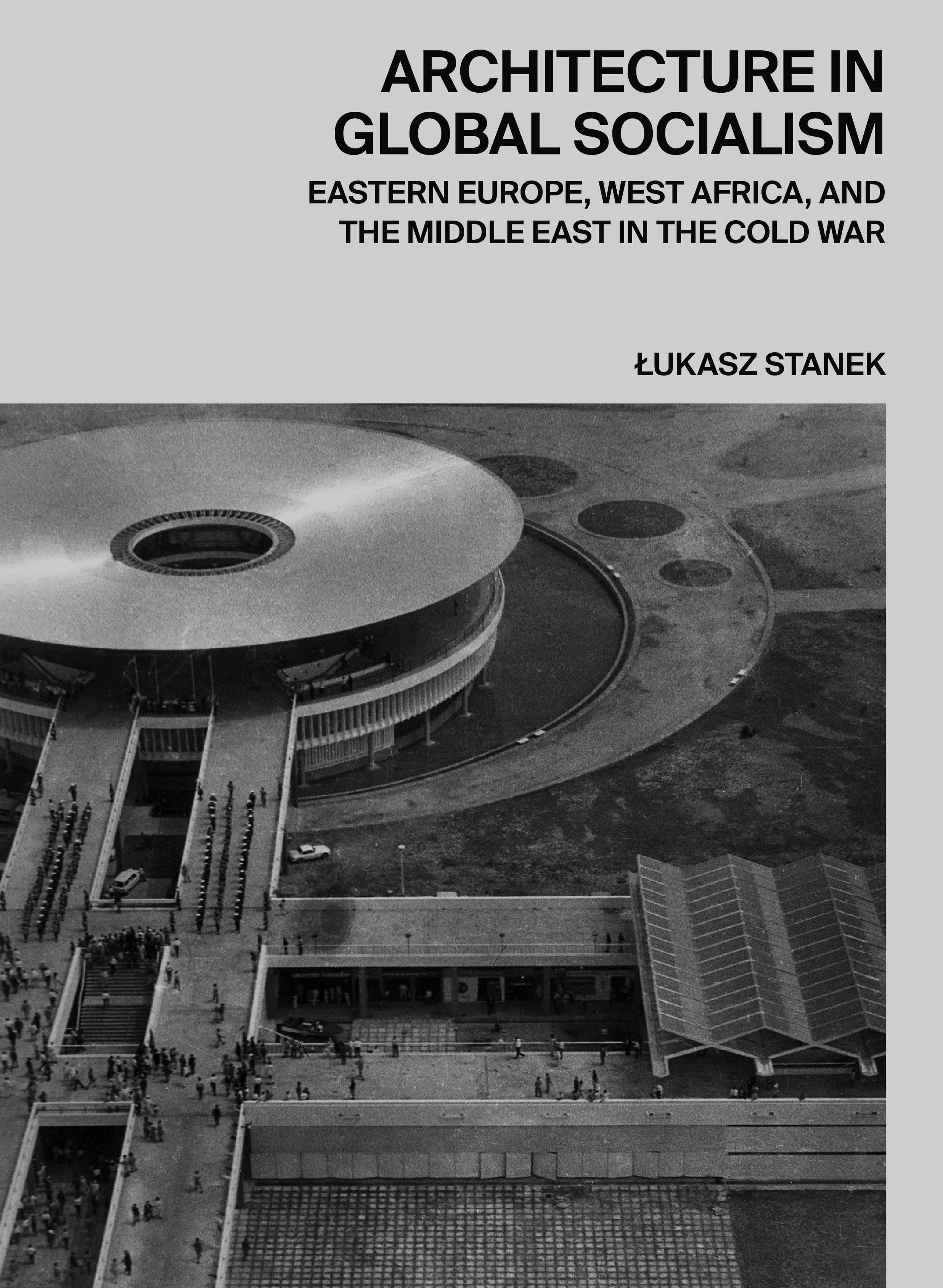
An Itch You Can’t Scratch: An Interview with Luke Bulman
Contributors
The Ooz
Luke Bulman is a graphic designer who operates Office of Luke Bulman in New York. He received an M.Arch from Rice University before serving as its Director of Publications and Exhibitions together with Kimberly Shoemake. As a lecturer at Yale School of Architecture, he taught Books and Architecture for a decade and is currently teaching a course called Graphic Inquiry.
Bulman works in the overlap between architecture and graphic design; he designs books about architecture, posters, and identities. Many important publications of the twenty-first century were “book directed” by him. But, “most of all,” he writes on his website, his design practice is “dedicated to finding ways to link subjects with objects.” Via email, Bulman graciously answered my questions about his career, the shared space of architecture and graphic design, and his creative processes. If you’re looking to make the next S,M,L,XL, please hire him.
Jack Murphy: How did your educational experience at Rice set up the interests you work on today in your practice? How did you arrive into the work you do today from the academic background of a Masters in Architecture?
Luke Bulman: Kimberly Shoemake (who founded the graphic design office Thumb with me) and I had an architecture studio with Mary Ann Ray and Robert Mangurian where they made books, we made books, the whole studio made books. We did this to organize things we found, to make sense of the research we were doing, and to explain things to others. We also liked paper an awful lot. It was like you couldn’t do a project at that time, and expect to be taken seriously, without having a book to back it up—the same way that the book acts as an alibi to an architecture practice extended into studio and school culture in general. It was also a time when Sanford Kwinter and Bruce Mau were collaborating on studio and seminar courses, so the discourse around communication was quite sophisticated. Many of the faculty were also committed to book projects; I’m thinking about Albert Pope’s Ladders as well as Michael Bell’s anthology Slow Space, both of which were wholly synthetic in form and message. So, as I saw it, one could use the book as a medium to put forward arguments about space, material, culture—kind of like doing architecture without the building. After we graduated Kimberly Shoemake and I were co-directors of publications and exhibitions at Rice and we got to experiment while learning a lot about graphic design. Lars Lerup, our dean at the time, was a great instigator; we really owe our launch into design to his support. After that I decided I wanted my own office and started Thumb in New York. Jessica Young, who had the Rice position after me, joined me there for a few years. Since then, I’ve mostly run the office with a few collaborators.
JM: Tell us about your commitment to the book. Why is it still a relevant technology to communicate information in a sequential order? How was the book an “instrument of architectural thinking” during your time at Rice and what was the influence of that pedagogy on your work?
LB: The book represents a commitment to the assertions of architecture into material form, not altogether unlike the building, but different in crucial ways. Once a book is set in ink and paper, in thousands of copies, ideas may proliferate (i.e. Victor Hugo’s ubiquitous “this will kill that” argument). The slowness of the book is part of its strength; its resistance and relative permanence demand that whatever is set into this medium be of consequence. We can admire the movements of magazines, Instagram, exhibitions, websites, etc., for their immediacy, but none of them have the weight of a book.
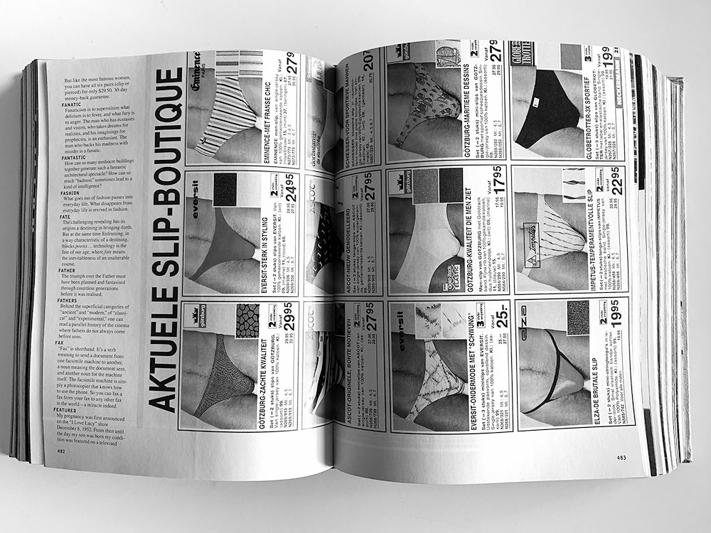
JM: Can you share an influential image that was important to you during this point of your education that impacted your thinking?
LB: That is the spread on pages 482–483 in S,M,L,XL – see below.
JM: What did you learn from Bruce Mau?
LB: A few sort of aphoristic things: Type has memory. Graphic design is faster than architecture. Communication is the strategic release of information over time. “A little song, a little dance, a little seltzer in the pants” i.e. sometimes you should just do what feels good. But mostly it was that I got spend time with someone who was a designer who engaged with architecture without doing buildings—that was a model for me.
JM: Do you believe in disciplinarity? What is the potential of two creative fields colliding together—in this case architecture and graphic design? Haven’t they always been joined together?
LB: I know a few things and you know a few things—we can work together to extend each other’s reach. If we both recognize the former, the latter can happen. If not, then not. That said, knowing the influences, precedents, and techniques of architecture makes it possible to use the internal language of architecture in pursuit of formulating a project with the architects that I work with… To me, scalar logic is the most crucial aspect of architectural thought. It makes it possible to address different aspects of the design project with the recognition that there may be echoes or implications at another scale. Systems awareness and tectonic/fabrication sensibility can also inform collaborations. A lot of the architects I work with are dead (i.e. Lina Bo Bardi, Paul Rudolph, Gordon Bunshaft, et al.) so the dialogue is as much with the work as it is with the architect; what becomes important is what I can identify as central to the set of ideas that they were working on across the span of their practice. Mark Wigley remarks that all architecture begins and ends as graphic design—it all starts with drawing and ends in a library—which seems pretty inclusive. Drawing matters a lot to our work, as we can’t really think without drawing and using it as a means to connect ideas to potential organizations. These drawings are sometimes diagrams or plans or sections; the array of conventional drawings is present in the flow of our work, but not necessarily in its final form.
JM: What are the differences in constraints that make architecture and graphic design uniquely challenging?
LB: The constraints are so vast for architecture; graphic design by comparison is a free-for-all. Each situation has its own advantages. While a graphic design office can have commissions at the highest level within a very short time, architects (for the most part) have to spend years gaining the trust of the individuals and institutions that support their work. The flip side is architects tend to have quite long careers, while finding a graphic designer over 50 is a rarity.
JM: How would you describe the area where architecture and graphic design overlap today? What do you like to work on in this realm? Why is it exciting?
LB: There should be more overlap in how a graphic program might be deployed in architectural spaces, but in my experience this type of commission is very rare. Other than graphic identity and websites, there really isn’t that much overlap.
JM: What might a more fused, oozy union of architecture and graphic design look like?
LB: Having a graphic designer in an architecture studio that was not there to do proposals and marketing, but rather was there to contribute to the development of wayfinding, legibility, color, typography would be an interesting thing to consider. It’s really worthwhile to look at the super-graphics that Barbara Stauffacher developed at Sea Ranch —incredibly rich integrations of type, space, and color—its work that has association with Lawrence Halprin, Charles Moore, and Bill Turnbull. In interviews Stauffacher makes it sound more like an improvisational performance, as her work was responsive to the architecture and the site. She said, “I just went from one wall to another.” Maybe it comes down to the freedom of cooperation (I like to note the importance of this word as much for its prefix as for its root). It comes back around to collaboration, which at its best promotes a mutuality of action, with common goals arrived at via multiple vectors. In a well-functioning collaboration one can still detect the autonomy of each actor. Maybe it’s a bit like the Black Mountain performance experiments that Cunningham/Cage/Rauschenberg/Fuller did—everything all at once, where the viewer has to decide what to look at, in what order they can, to whatever effect they find. Maybe that makes it more open for everyone.
JM: Your clients are regularly schools of architecture, architects, or architecture offices. How do you still participate in architectural culture? How do you understand—and how might you describe—the extra-architectural apparatus that allows architecture itself to exist?
LB: I held the Books and Architecture seminar at Yale School of Architecture from 2008 to 2018, which is probably the single most sustained engagement. We might do that class again, but right now we’re running a new thing, Graphic Inquiry, which works back and forth between screen and print, using material culture research as a driver. The work is trying to find a way to get past the fly-through video towards a more meaningful engagement between the moving image and architectural thinking. Directional temporal experience seems to offer a lot in terms of image, but what we’re really most interested in is text-image combination that acts in a descriptive manner. I engage with architecture schools on an ongoing basis. We got the chance to design and roll out an entire identity program at University of Minnesota with program head Marc Swackhamer over the last few years, which was really propulsive. We developed a low-profile identity to keep everything consonant and then created several publications lines, producing about eight to 10 books in the last two years. I tend to engage more with schools than practice. We just completed a project for UMinn with Dream the Combine to represent their MoMA PS1 project in a book format, which was a real pleasure.
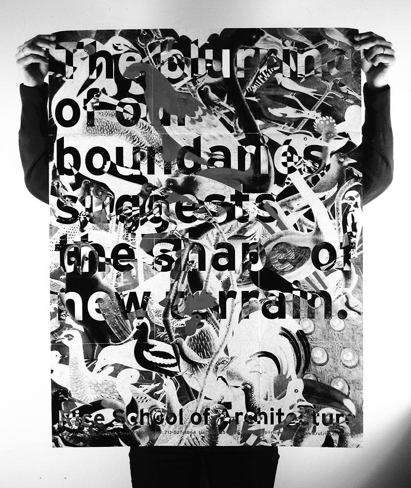
JM: Can you share an image you like that complicates the relationship of text and image? Nothing beats Bruce Mau’s poster for Rice, c. 1997: “The blurring of our boundaries suggests the shape of a new terrain” – see below.
LB: One goal of graphic design is clear communication. How do you see your role as helping architects to communicate their work into the world? Is this challenging? If so, why?
JM: I’m still waiting for a chance to take up some of the threads that were left dangling by S,M,L,XL. The book’s open figure, full of detritus as much as gems, (stim and dross?) suggests contingency and complication as something to be sought. In most of the monographs I see today everybody is working so hard to find a position or to defend territory that the projects end up seeming disconnected from the world. That seems like a weak position for architecture. Look at Keith Haring’s Radiant Baby—it kind of says it all. –see below.

JM: What comes after S,M,L,XL in your view?
LB: I don’t know, but if you open the process of making a book up to contingency, to suspending boundaries at least temporarily, I’m pretty sure something would happen.
JM: The responsibility to make good space is a somewhat oozy item, as it is not really the sole concern of architects anymore, if it ever was. How do you work to place graphic design in space, whether it is the space of an interior or the space of a book? Is space a primary conceptual concern of your work?
LB: We can be concerned where something is or is not, i.e. “Do things align? Is spacing consistent?” These are the simple issues of space we are concerned with in graphic design. But I’m interested in voids—that is, vast empty spaces that are somehow places: temporary spaces, pop-up spaces, light spaces, “it’s a shame that anything should be built here…”
JM: Where does inspiration come from?
LB: An itch you can’t scratch.
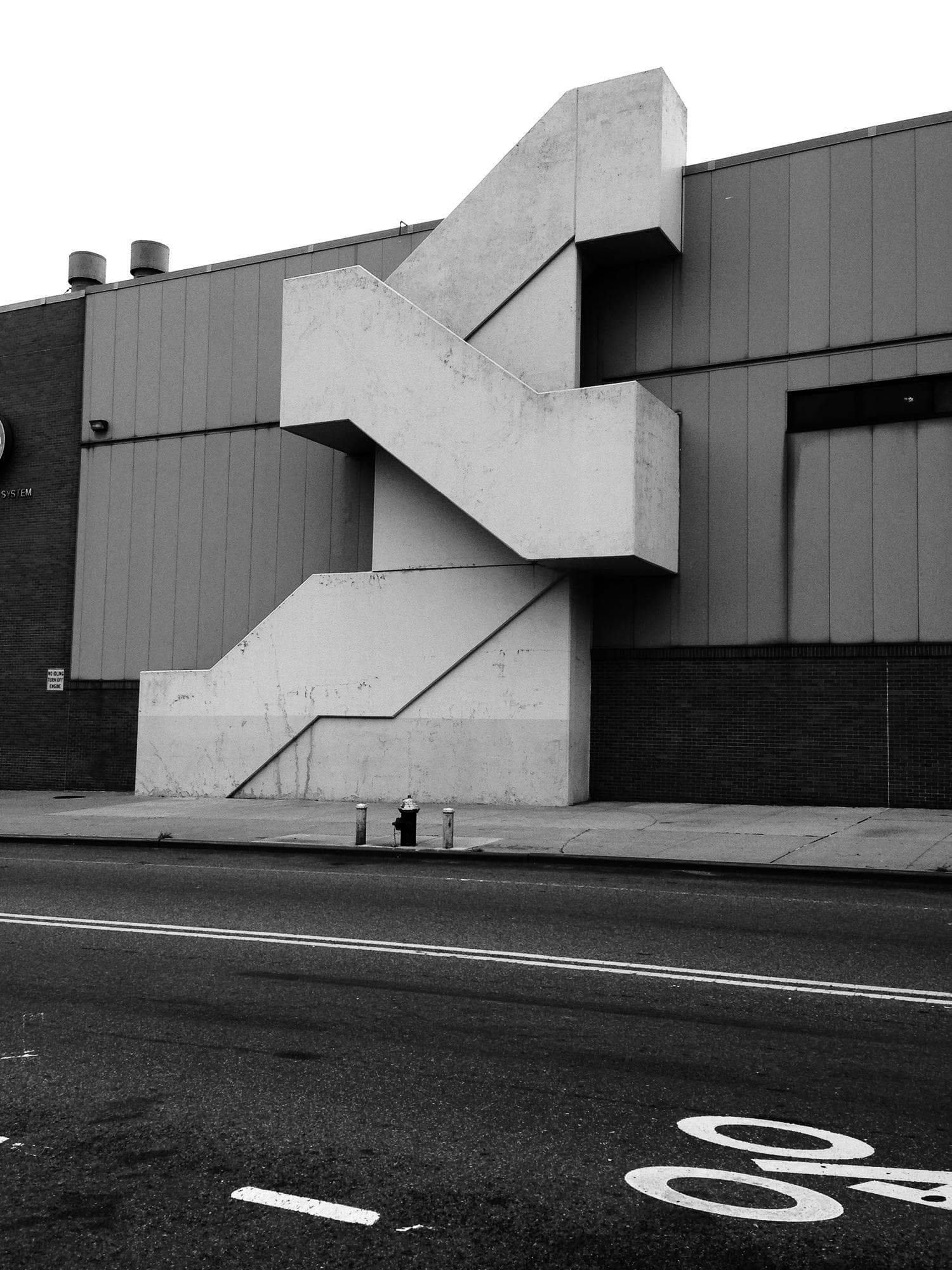
JM: What do you look at that most reliably leads to good ideas?
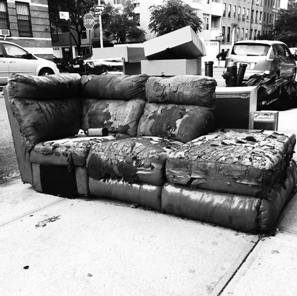
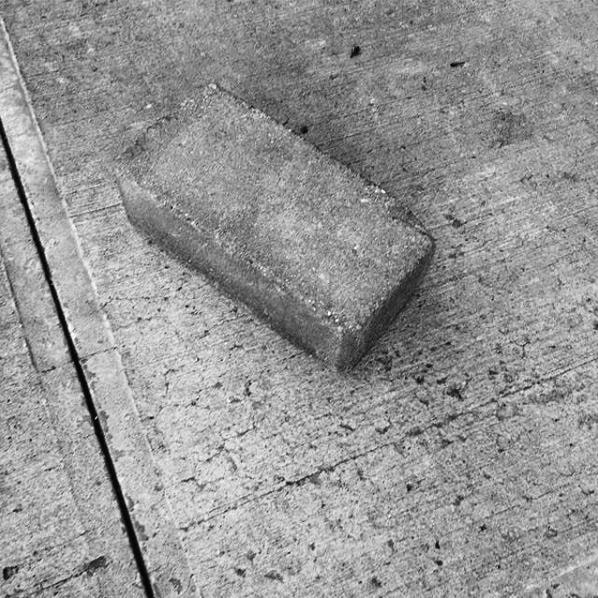
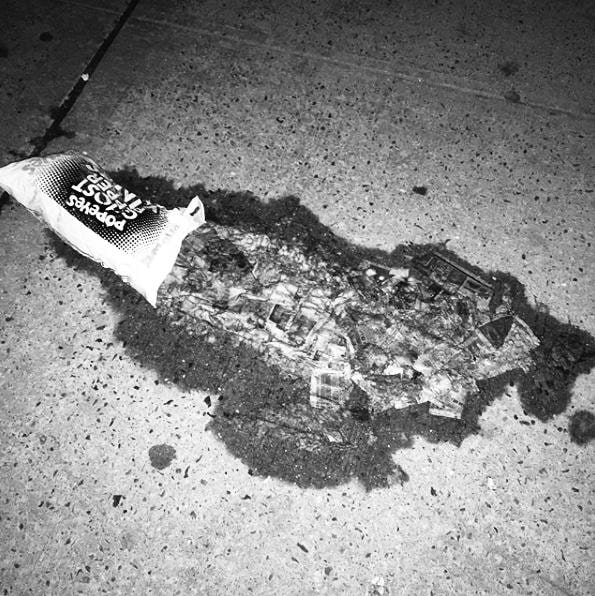
LB: Stuff on the street. New York simultaneously draws repulses me, so I document those moments when I’m amazed by what is put/left/ejected on the street. I’m inspired by cognitive dissonance. I don’t think this leads to good ideas, but it’s a sign that I’m processing.
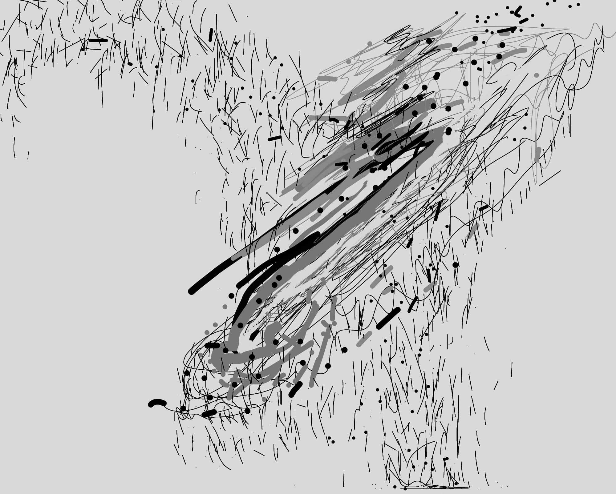
JM: Can you share an image of work in progress that you’re fond of?
LB: See below.


JM: How do you start a project and begin the movement from information to visualization/organization/design? Do you have a process you rely on?
LB: I usually like to think about format first, i.e. how big a thing is. This conditions the design quite a lot. After that, maybe what paper(s) might be used—sometimes a paper combination might begin to indicate a structural logic to the book due to manufacturing constraints. We really prefer projects that have more limited budgets where we can commission the production; this means we need to think about limits and how we might push/pull them.
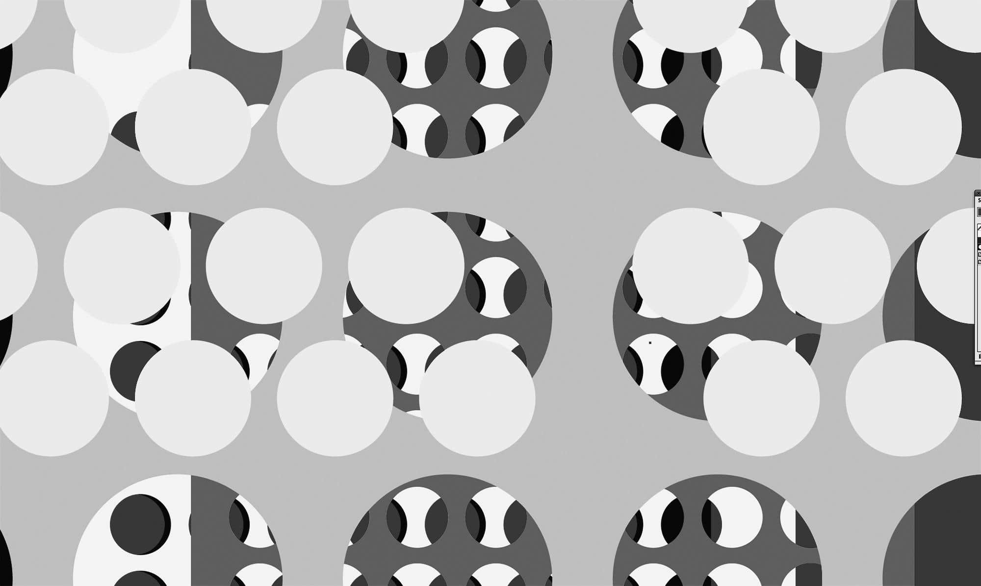
JM: Can you share a couple alluring images you’ve seen recently?
LB: See below.

JM: Everything is so sharp these days. What’s the value of blur, ambiguity, or low-resolution work in our HD world?
LB: The lower the resolution, the faster and further it can go.