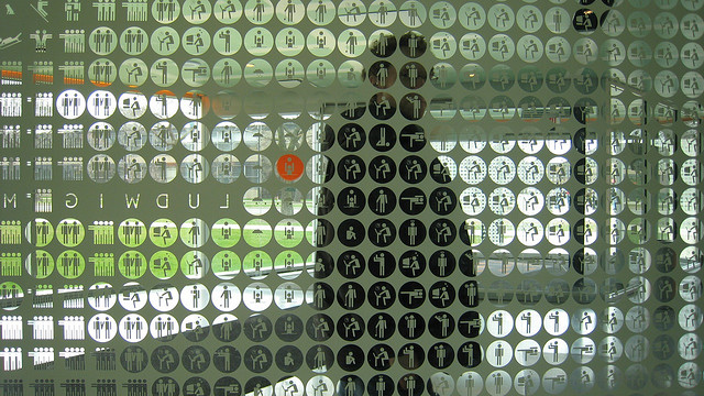
A View of Rudolph Hall from the Paul Rand Center for Graphic Design
Perceptions
11.05.2015
By ERIK FREER (MFA ’17)
From my perspective, I see architecture and graphic design in the same field. I feel graphic design is deeply intertwined with architecture, embedded within the many smaller divisions of the larger profession, some still forming as new technologies present themselves and others, relics of the oldest remnants of human necessity.
Outside of my personal perspective, although purveyors of both skill sets have the capacity to connect with one another, there exists a certain distance between practitioners within these two design distinctions.
Designer and typographer Erik Spikermann writes in a 2014 article in Design Observer that some “architects treat type as a redundant tool and graphic designers as inconsequential.” This gulf between professions prevents important lessons both have to teach from being learned. Nevertheless, I find hope in convergence, leading me to the experiential. As environmental graphic systems, exhibition design, wayfinding and signage make their way more and more into buildings, a budding meeting of the minds in the digital age blurs the boundaries of our professions.

Before the time of computers, the human hand linked both industries in a more easily defined manner. Frank Lloyd Wright made such an impact with the lettering on his drawings that its style became the rationalization for his building’s graphic identities. Spikermann elaborates: “architects used to need to know about type, of course. Lettering on blueprints, being an integral part of the drawing, had to be legible while conveying a sense of style.” As we shift away from the human hand and move toward software and the screen, the link between our work, and how we communicate it has shifted to large firms such as SOM creating their own in-house branding and graphics teams where graphic designers and architects work together.
Today collaborative practices like Common Room, a studio, imprint and exhibition space based in New York, Brussels, and Zurich involves a group of architects, an architectural researcher and a graphic designer. This pluralistic practice promotes a dialogue and collaboration that presents exciting work, bridging the gap between the graphic and architectural, made possible through advancements in printing, fabrication and computer technology to create successful projects like the New Art Dealers Alliance spatial identity and art fair layout.
Together, a communicative team of graphic designers and architects can be a powerful combination, imbuing building projects with new and distinctive perspective in scale and materiality. The design of the Office for Metropolitan Architecture’s McCormick Tribune Campus Center at the Illinois Institute of Technology in collaboration with 2×4 creates an intervention of a vibrant “graphic vocabulary” within Mies Van Der Rohe’s original master-plan. Inspired by the playful architectural ornamentation here on the Yale campus, 2×4 and OMA employ an icon set as an ironic take on the “‘modern’ student,” one, “engaged in a number of activities, both licit and illicit.” The icons live at many scales, ranging from one-inch pixels that create super graphic portraits of the IIT university founders and Mies himself, to large fifteen-foot tall figures, standing at the programmatically complex center’s entrance. The use of graphics in tandem with the articulate but innovate architectural re-envisioning within the overall plan creates a dynamic sense of coherence, instilling a new energy in the original campus.
In buildings, the implementation of graphic design can allow architecture to incorporate cost effective solutions in spatial hierarchies and visual character. With more emphasis on orientation and distinctiveness than ever, today, through increased access to fast and inexpensive technology, already, the graphic vernacular has quickly found itself more and more prominent within the architectural discourse. Through an improved understanding of the importance and usefulness of graphic design, along with a furthering communication around site and scale, I feel we will be able to see more growth, variation, and successful design overall. As a designer, I anticipate a career of collaboration and plurality with architecture and look forward to further blurring the lines between the professions.