Palimpsest: Ambivalence and Validity in Gwathmey’s Addition to Rudolph Hall
Issue 02
CHARLES KANE (M.Arch ’16)

Ambivalence — not apathy as the word is sometimes misconstrued, but vacillation — defines Gwathmey’s Loria Center. Journalists wrote many articles about the Rudolph Hall renovation (formerly the Art and Architecture Building) and the Loria Center construction in 2008. As with most building critiques, the analysis maintained a tempered distance from the subject — oddly detached like a coroner observing the wounds on a freshly delivered cadaver. Perhaps the detachment stems from a physical dislocation from the subject matter. The reflections hinged on immediately visible details; Amelar’s critique in Architectural Record, among others, mentions the material palette, the entrance(s), an elevator shaft, but rarely mentions space or design concepts.
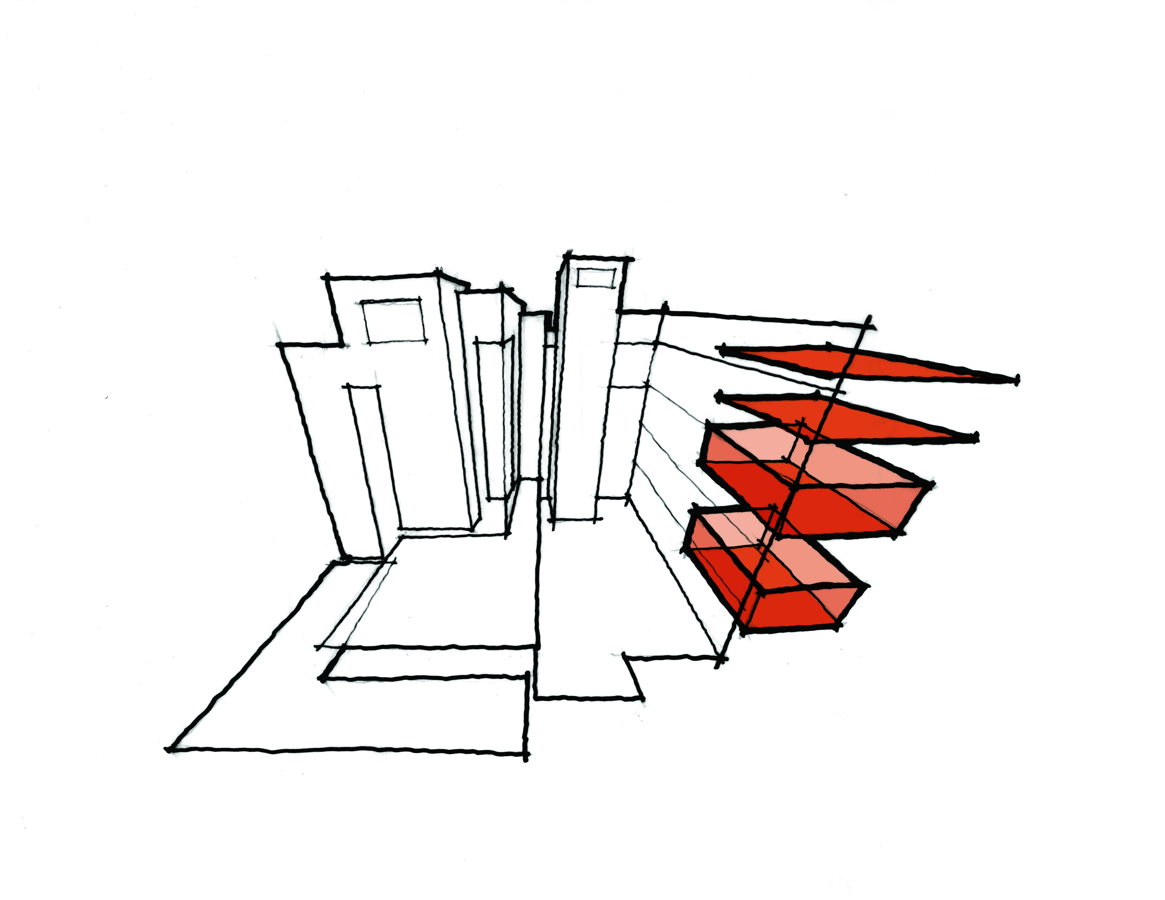
There is indeed a theme that runs through the Loria Center in relation to Rudolph Hall: ambivalence. Upon a close analysis, the designer’s approach to the building presents multiple readings: an independent entity, a deferential shadow, or an extension in dialogue with the masterfully imperfect Rudolph Hall. This uncertainty undermines the Loria Center’s ability to successfully embody any one position in relationship with Rudolph Hall.
In many ways Loria performs as an autonomous entity from Rudolph Hall — duplicated elements between the two buildings support this argument. As noted in the New York Times and the Architectural Record articles, the entrances are duplicated. Rudolph Hall’s recessed grand stair, slipped between two cavernous shear walls, stands vacant next to Loria’s unassuming, yet highly trafficked vestibule. Accessibility requirements forced the second entrance, but the fact that the two entrances lead to distinct lobbies amplifies the autonomy of the buildings. The shared elevator serves as one of the overlaps between programs. Sadly, card-operated doors greet both departments once the inhabitants step off the elevator — with neither program having access to the door to the alternative side of the building. Despite the proximity to one of the two programs, they remain spatially separate. It is impossible to conceive the disconnection as intentional. Instead, placing the two programs in such proximity promotes an understanding of cross-pollination — to recapture the mixture of disciplines or the chance encounters that Weir Hall once offered to the Fine Arts Department.
Loria struggles to achieve a consistent dialogue with Rudolph Hall — themes twisting and snapping under the shear weight of the clear, powerful structure by Paul Rudolph. Adler noted that the eastern façade (i.e. the entry face) adds foreign forms and materials that “offers more distraction than satisfying counterpoint.” Despite the validity of this critique, similarities in massing strategies exist — especially on the Western Façade; looking past the material disparity, thin discrete towers (i.e. circulation cores) interlock and climb upward in both Gwathmey and Rudolph’s designs. Whereas Rudolph considers this approach three-dimensionally on all faces, Gwathmey utilizes the strategy inconsistently — decreasing the legibility of this connection.
The original Rudolph design is organized around a dispersed center. The critique spaces, the gallery, the main auditorium — marked by the distinctive Paprika! orange carpeting — all occupy this central core of the building. These spaces are not static; the sectional dynamism allows for loft spaces, light wells, and most importantly, visual and physical connections across floors. Programmed spaces fill the areas surrounding these central zones creating charged, activated voids.
Gwathmey understood the importance of this centrifugal configuration and utilized it to organize Loria Center. The new approach to this voided center is simultaneously the least and most successful spatial feature of the Loria Center. The success begins on ground level, but the clarity diminishes as one moves vertically. The library addition not only utilizes this spatial type but also allows for the new triple height space to serve as a link between the existing library on ground level and an extended subterranean level. The center here allows for voyeuristic overlaps; Saarinen’s womb chairs in the void can be seen from the study tables above, from thin vertical windows on the basement level, and from the entrance to the gallery on the second level. Above, a new auditorium occupies the void. However, this attempt does not allow for spatial connections — expansive, blank, and obscure to those moving along the adjacent corridor. Above the lecture space, the central void transforms into a green roof — exterior and completely uninhabitable but surrounded by a seldom-occupied terrace. With the footprint shrinking on the upper levels, the central void erodes completely after the roof terrace. Again, the approach appears unsteady as the character of the void changes drastically in each incarnation — Rudolph never wavered from the diagram of the charged void.
The Loria Center neither quietly echoes the language of Rudolph Hall nor demands the same acknowledgement from the street as the muscular Rudolph Hall. The design strategies — apparent in Rudolph Hall — dissolve in Loria to genuflect to the unfettered clarity of the massing strategy and the voids of Rudolph Hall — left incomplete by Gwathmey as a sign of respect to Rudolph. The Loria Center allows for Rudolph Hall to exist in the pristine form it does today. The critique spaces host reviews, informal dinners, panel discussions, formal badminton tournaments, impromptu naps. The fire stairs with double and triple height spaces still serve as the primary mode of inter-studio circulation and a place for chance encounters, lunch breaks, musical performances, phone calls, and reading. However, the inability to link the two programs stands as the major shortfall of the addition. Loria extended the longevity of Rudolph Hall and allowed for future generations to discover this masterpiece — not a competitor with Rudolph Hall, but a facilitator of permanence in a culture of obsolescence.