Students on Form and Discipline
Form and Discipline

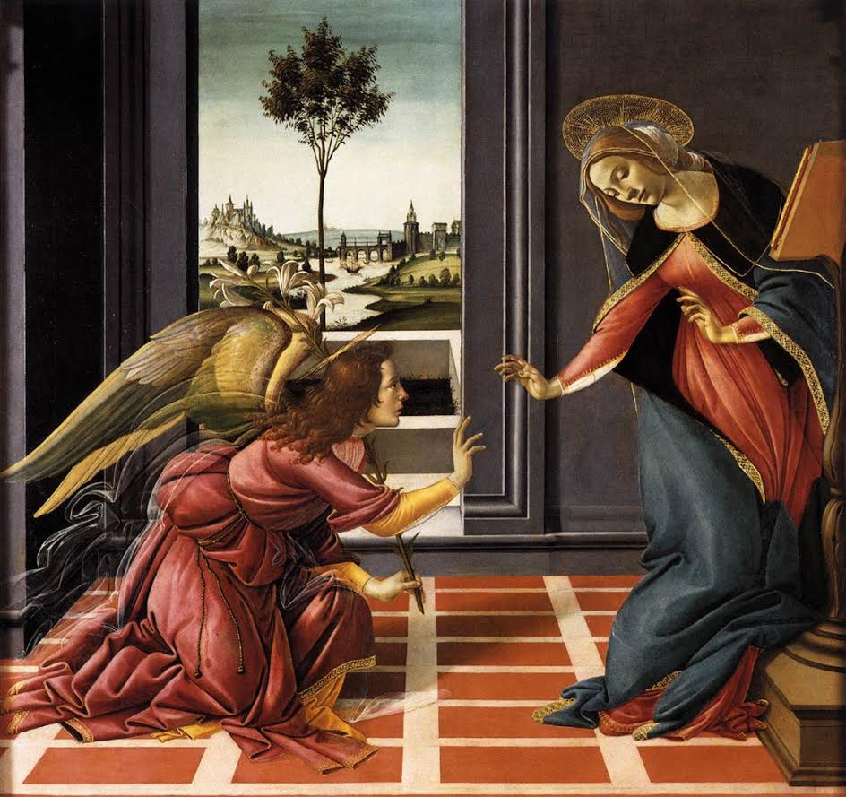
The Annunciation 1449 – Sandro Botticelli
DIMA SROUJI and SARAH KASPER (M.Arch ’16, M. Arch ’16)
Instead of looking to architecture as precedent for our project in Peter Eisenman’s studio, we are drawing upon the principles of Alberti’s text Della Pittura (1435) as manifest in Sandro Botticelli’s painting Cestello Annunciation (1489). In adding onto Palazzo Rucellai, we are preserving the only existing Albertian structure – the facade – allowing for the formal composition of the diptych to be designed both as a new elevation adjacent to the existing façade as well as in the depth behind the facades. With this tabula rasa, both adjacent to and behind Palazzo Rucellai, a framework based on the prescripts of Della Pittura and their manifestation in the Annunciation allows for a choreography of forms that define our diptych composition. Like the gridded floor tiles of the Annunciation, based on Alberti’s introduction of perspective, two superimposed grids derived from Alberti’s original façade dictate the volumes that will become the three dimensional forms of our diptych. Oscillating between the rational and the pictorial, contextual forces shear the volume to establish a void at the hinge. From this initial framework, additional contextual forces from the triangular piazza at Rucellai signal entry along the diagonal and carve away at the mass beyond. This conversation between existing and new, solid and void, ideal and destabilized, draws upon the call and response of the Annunciation, establishing forms in dialogue and poised for union, yet separated by the activated void of the hinge.

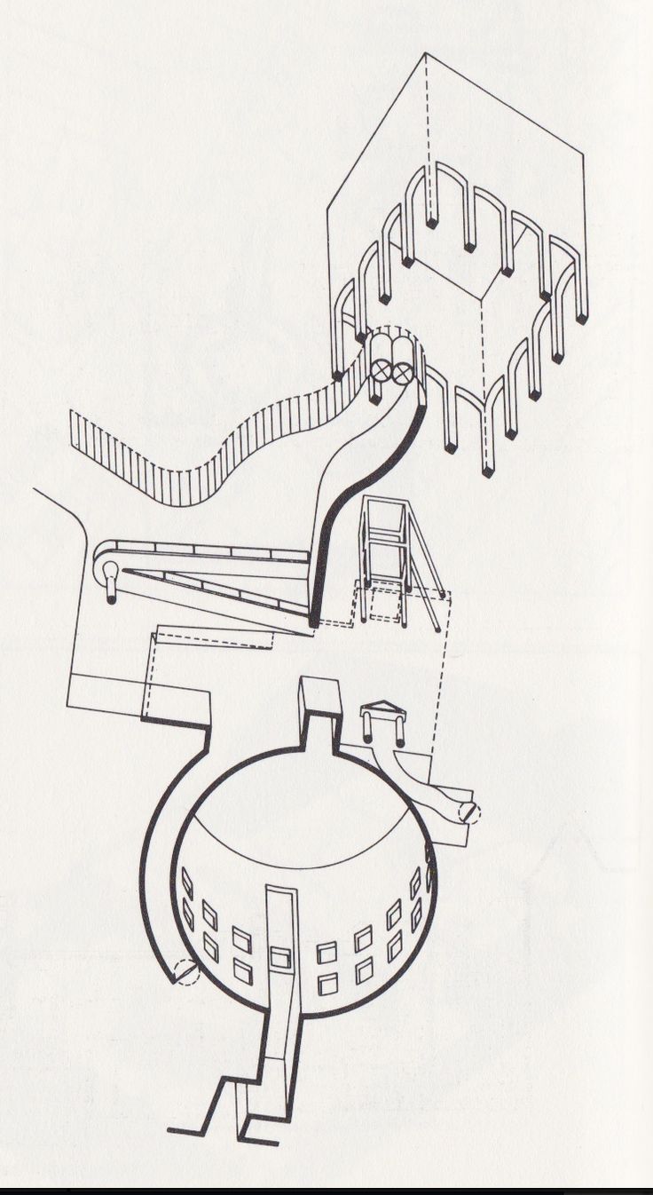
Dusseldorf Museum of Art 1980 – James Stirling

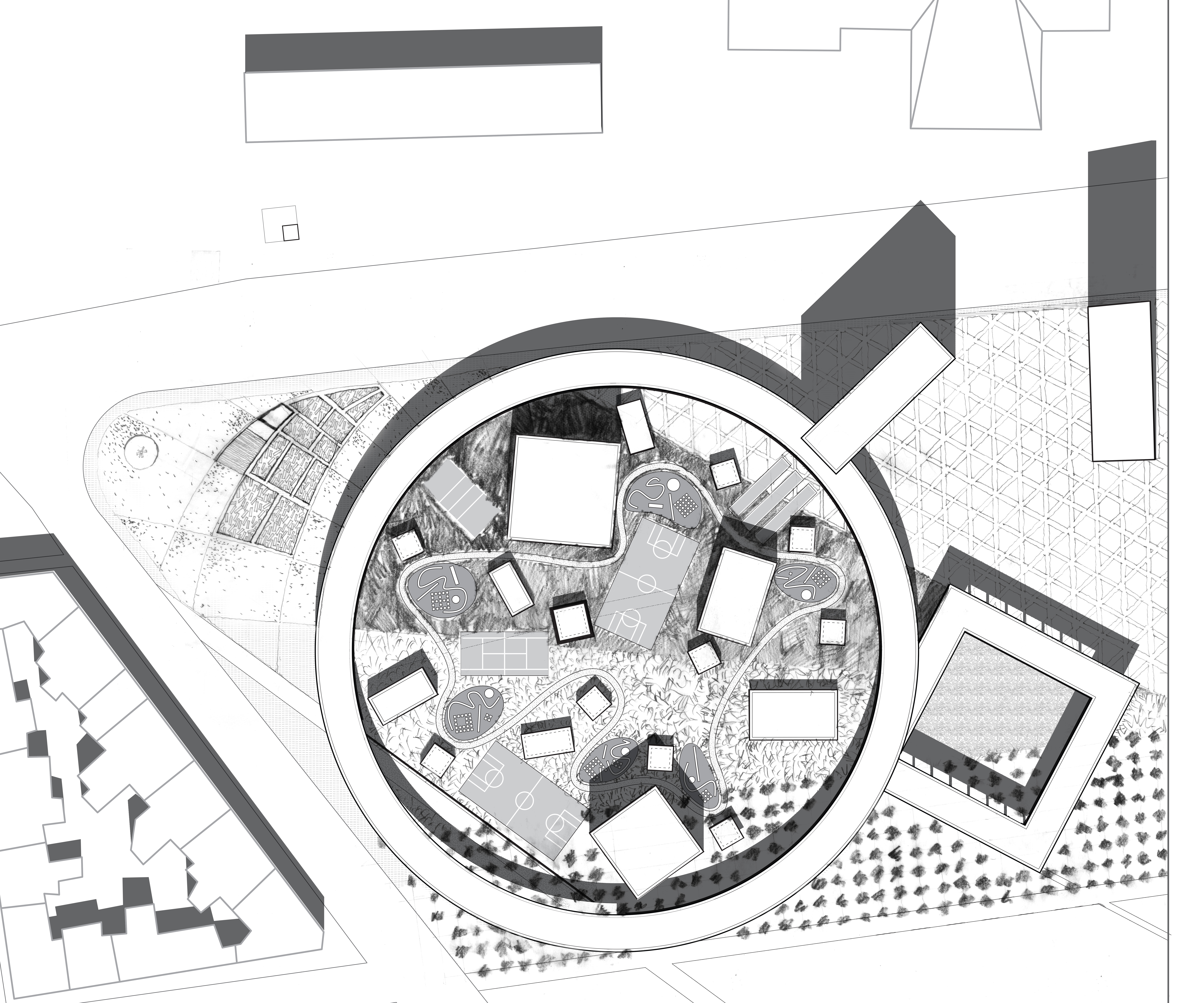
Plan – Chalres Kane – Elia Zenghelis Studio Fall 2015
CHARLES KANE (M.Arch ’16)
Explicitly, this is a school building sited in Thessaloniki that is part of a larger masterplan undertaken with the entire Zenghelis studio. Implicitly, this project focuses on the relationships and complexity generated through overlapping typologies. My aim is to resolve the conflict created by the intersection of the various objects within the project. Furthermore, I am studying the relationship between the autonomous court spaces and the larger context. Though I have looked at a number of references throughout the semester, Jim Stirling’s 1975 Nordrhein-Westfalen Museum proposal for Dusseldorf remains a key precedent because of his mastery of composition and complex circulation in his designs. The interaction of discrete objects within Stirling’s proposal remains useful in the development of my project as a high watermark toward which to reach. As my project evolves, it is important to return to this reference as reminder of the apparent simplicity achieved through this complex arrangement of objects, spaces, and paths.
ETHAN FISCHER (M.Arch ’17)
At the Republican Presidential debate on November 10th, 2015, Marco Rubio stated, “I don’t know why we’ve stigmatized vocational training. Welders make more money than philosophers.”
The site for the second year studio project, which calls for the design of the Michael Graves College of Design at Kean University, is located across a four-lane roadway from the university’s main campus and adjacent to an enormous defunct pharmaceutical plant. Aerial views reveal simple rectangular volumes stretching perpendicularly from the road and connected by networks of parallel overhead utility pipes. The volumes communicate linear movement and standardization. On the other side, a traditional campus: evenly distributed buildings of eclectic architectural styles surrounded by green spaces and connected by walking paths.
Sean Keller, in an essay on Peter Eisenman’s early work, notes “architecture is, in fact, defined by the contradictions and tensions between the pragmatic and the conceptual, between the actual and the autonomous.” The welder’s task is to join pieces of metal with straight, regular lines of fill. There is a new technique, known as weave welding, which is gaining popularity – it allows the welder’s hand to meander back and forth, yet still travel in a straight line.
JAMES KEHL (M.Arch ’16)
Since midterm, the Caples-Jefferson studio has thought about different architectural strategies that could help create a memorable identity for our building—or what we call a “mark”—on our site in Central Harlem, which is directly across from the Apollo Theater. I learned about the architect Ralph Rapson and his Guthrie Theater project—a now demolished cultural treasure in Minneapolis. This theater had a layered facade comprised of a curtain wall behind an externalized grid of architecturally-scaled frames. These frames, transitioning from thin lines to solid slabs at cornice-height, created a powerful sense of drama and captured snapshots of activity inside the theater.
My own facade design has a similar ambition—to display activity and performance (of tenants and musicians) to the life on the street. Yet, a criticism my project received at midterm from some critics was that the 80′ high street-wall of my building looked too transparent—even flimsy. The framing strategy of the Guthrie seems like a promising precedent as I continue to think about ways to strengthen my concept, and ‘mark’ this important place in Harlem.
LUKE ANDERSON (M.Arch ’16)
Through a series of early formal exercises, I began to develop a nine-square grid. I’m now using this as a strategy to organize different scales of information and experience within the observatory. I have been looking at a number of Kahn’s projects, specifically his Trenton Bath House. It happens to have an implied nine-square in plan and I am drawn to its unrelenting simplicity. Single elements play multiple roles in the composition of the building, and it is through this economy of form that I find his work so influential. In many of his projects, the form is a seemingly unquestioned condition of the building – as if it is a “necessary” precondition to the experience. In my own project, I’ve been thinking about this formal simplicity. The eight spaces around an open courtyard are variations of the same tectonic system. The height and orientation of each is determined by the use and experience within. Curved walls turn into the building and slip underneath the pitched roof planes, creating openings for light and circulation. By eliminating typical windows or doors, the boundary between interior and exterior can be defined through the simplicity of solid, opaque, walls and roofs.
APOORVA KHANOLKAR and ISAAC SOUTHARD (M.Arch II ’16, M. Arch II ’16)
The trajectory of water in the Chinese context has been long; from its philosophical origins as an element of recreation and protection, it was first privatized in Imperial times, and later institutionalized as an infrastructure in the production machine of Socialist China. Today, many of Beijing’s scarce water resources remain bracketed into the pictorial and the engineered. Water enjoys little engagement with public life, and has instead come to represent both social inequality and ecological neglect in the manner of its distribution and consumption.
Our proposal breaks down Beijing’s contemporary relationship with water through a comprehensive democratization of the Tonghui. This act begins by exposing new processes of water treatment and purification such that they are made visible to the public. The river is integrated with the urban realm as a singular system through functionally driven strategies that embrace its manifold opportunities. Water supports a food industry in legitimizing the city’s marginalized communities by folding them into the mainstream. It also offers productive, community-driven engagement in the form of recreation, bio-tourism, resilient ecologies, flood control, and integrated living.
A number of ‘water towns’ along the riverfront are linked not by a single spatial narrative, but by the instrumentalization of water as a productive landscape across varying degrees of rehabilitation and food production. Within the framework of a global metropolis, the project balances the scope for new resource-efficient lifestyles with the realities of urban growth. At the scale of the individual, the project becomes an exercise in programming the irreducible unit of development not as a backdrop but as an active frame for functional waterscapes.
Water is then the backbone of a new kind of fabric-making that promotes quality urbanism, ecological restoration, economic sustenance and social integration without resorting to the nostalgia of the hutongs. It breaks free of its current shackles in becoming both an amenity and a resource for a new and responsible Beijing.
DANIEL MARTY (M.Arch ’17)
This project is a study of in-between space and nesting. In this architectural school, three tectonically unique objects are nested within a spatial matrix. The presence of these architectural bodies creates a series of different in-between spaces. O.M. Ungers’ Deutsches Architekturmuseum has been a source of inspiration for this study. While the project is a renovation of a previous building, the architect nests two tectonically different structures within the building, allowing the overall composition oscillate between spaces that are light, heavy, and voids.
What I have attempted to emulate from Ungers’ museum is the way he uses these two objects to influence the character of the surrounding spaces. While my project frames this in-between space as a kind of generic space that the objects imprint themselves onto, he uses the two structures to change the character of the existing building, and uses a rationalizing grid to bring the two disparate spaces into the same language. Ultimately what the architect does so successfully is the way the grid interlaces with both objects – allowing the rationality of the grid to seem somewhat soft and flexible. The dialectic these nested objects exhibit of simultaneously responding to the rationality of the grid and impressing different attributes upon it are elements I have tried to bring into my own project.
MADISON SEMBLER (M.Arch ’17)
The Rolex Center by SANAA provides an example of an institutional building that is molded by the anticipated movement of its occupants. When asked to design an architecture school, I found this project to be the most compelling precedent because the form is derived from and built to accommodate a specific social condition. Those who walk through the undulating mat building encounter an organic floor plan meant to thread together fluid social encounters.
My proposal for an architecture school anticipates a collective studio environment conducted on a large open floor plate with specified enclosed program undulating and wrapping around the studios. The formal strategies of my project borrow from SANAA’s plan while simplifying the geometry. The circle yields a non-directional space of participation in the studios. The ramp displaces non-studio program from the open floor plate while maintaining a strong connection by gradually sloping along the edge. The Rolex Center’s expansive floor plan and subtle sectional shifts directly inform similar decisions made in my own project.