Visible Shadows and Shared Surfaces: A Conversation with Linked by Air
Contributors
An Image for the Present
Linked by Air is a New York-based design and technology firm founded by Tamara Maletic and Dan Michaelson. AJ Artemel and Willis Kingery spoke with Dan and Christopher Roeleveld about Linked by Air’s 2018 redesign of the YSoA’s website. In addition to running Linked by Air, Dan is an instructor and critic at the Yale School of Art. Christopher was the lead designer responsible for the new YSoA site:
AA+WK: What did YSoA need when they came to you for the redesign of their site, and in turn, what did you think they needed? At this point you have a long history of working with educational institutions, including architecture schools, so we’re curious what you thought differentiated YSoA from similar institutions, and what you wanted to do with the site that would differentiate it from your past work?
Dan Michaelson: One thing that struck us is things like Paprika!: The YSoA and its students as a publisher, not infrequently in collaboration with the graphic design program, and YSoA as a part of a broader creative community at Yale. This spirit of community is really special at YSoA, and it’s one of the best aspects of the university.
AA+WK: You’ve had a close relationship with Yale as a student, instructor, and critic for some time now. You designed Perspecta 34 in 2003 and redesigned the YSoA website in 2018. What changes have you noticed in YSoA over those 15 years? Did this relationship inform the design of the new site in any way? Has your role as a graphic designer collaborating with architects changed over that period?
DM: I only really gained a broader perspective on the architecture school once we surveyed it comprehensively as part of designing the website in 2018, so it’s hard to say from personal experience. A value we wanted for the site is “radical professionalism,” and I think that does imply at least an engine of progress.
AA+WK: Can you talk about the visual and structural metaphors you derived from the architecture of Rudolph Hall and how the physical space of the school shaped your thinking in designing the site? Can a website play off the history and social consciousness of a building? One could argue you have to visit a building in the world in order to fully evaluate it – that mere representation of architecture through images is in some way lacking. How do you render the “realness” of architecture in a digital space?
DM: I’ve loved Rudolph Hall since I was a student here, and I thought a lot about Rudolph’s (apocryphal?) claim that the building should be truly comprehensible only to its students, when Linked by Air designed the School of Art’s website in 2006.
Chris Roeleveld: I tend to think that Linked by Air eschews metaphor, and instead borrows liberally from the function and politics of a space. What goes on here? Who is allowed to participate? I think when we do approach metaphors it’s with a certain skepticism or sense of humor.
DM: In a tongue-in-cheek way, we adapted some aspects of the architecture, such as the importance of the section view with the deep rollovers, and the carpet menu. More seriously, or less skeptically, the experience of section in the space seemed really important to us.
As a student you are working in one discipline or year or crit, and you literally see the others in the background. Structurally the site does try to behave that way too. One obvious way we brought that to the fore was with the “Pit” feature of the site, a pin-up of all the images ever uploaded into the CMS.
I happened to talk recently with a former designer at Gwathmey Siegel, and was reminded of the subtle ways in which the building was made both more accessible and somewhat flattened through the renovation. She said she made sure to leave visible shadows of some of the in-between floors that were leveled out. I guess that’s the best that graphic design can usually do, too.
AA+WK: With many of Linked by Air’s websites, you inherit a pre-existing brand or visual identity you have to work with or incorporate, but for all intents and purposes, is an institution’s website its primary image today?
DM: I do think user experience is the best way to think about brand, and often when we redesign an institution’s website, it’s a big chance for that institution to think about the intersection between identity and UX. Paprika, Perspecta, today’s Rudolph Hall, the studios, the whole corpus of student work, the fact that the site works pretty well for users who are blind – these are all important pieces of the school’s identity for sure.
AA+WK: You’ve spoken previously of platforms functioning as governance structures that inherently come with limits and affordances. The YSoA site pulls and filters images from a wide variety of sources, including the school’s Instagram account. What new affordances can be found in this convergence of multiple platforms?
I think it offers some serendipity and sense of life. It turns out to be really pleasurable to explore via image rather than a more top-down taxonomy. But, this only works when the images are great, so it started from the observation that there was really beautiful and fun stuff to work with.
AA+WK: Have you ever been tempted to give the student body of another educational institution as much freedom in editing the content of a site as you gave to the student body of the School of Art at art.yale.edu? Could any part of the YSoA site function as a public space? How did you envision information flowing internally between different disciplines and groups of students?
DM: The two sites are based on versions of the same CMS, Economy, which we originally developed for art.yale.edu, so I have sometimes thought that it’d be neat to connect them through a shared database – a kind of arts campus. And I can certainly imagine a next phase of architecture.yale.edu where particular areas of the site have a more open approach to publishing. In my experience this almost has to emerge out of need – in order to make the updates, these are the people we need to give access to. Often the website CMS does provide a very agreeable shared surface for cross-functional, outward-facing communication at an institution, sometimes almost for the first time. That can be a really beneficial, and ongoing outcome of a big website project.
But especially today, students aren’t necessarily lacking in ways to publish. The question is to what extent do they even want to “take over” the “official” channels of the school’s identity, and to what extent does the school want to delegate that authority to them. There isn’t really one right answer to that.
AA+WK: What is your approach in applying aesthetics to information and its flows? Technology and information now seem packaged by a handful of default aesthetics that imply newness or futurity, but don’t accurately represent its functions or intentions. Perhaps certain network aesthetics dating back to the 60s had fidelity in representing physical infrastructures – Superstudio [H] using the grid as a method of equal distribution, to name one example – but how do you give form to today’s platforms, networks, and political arrangements which are seemingly more nebulous and more complex?
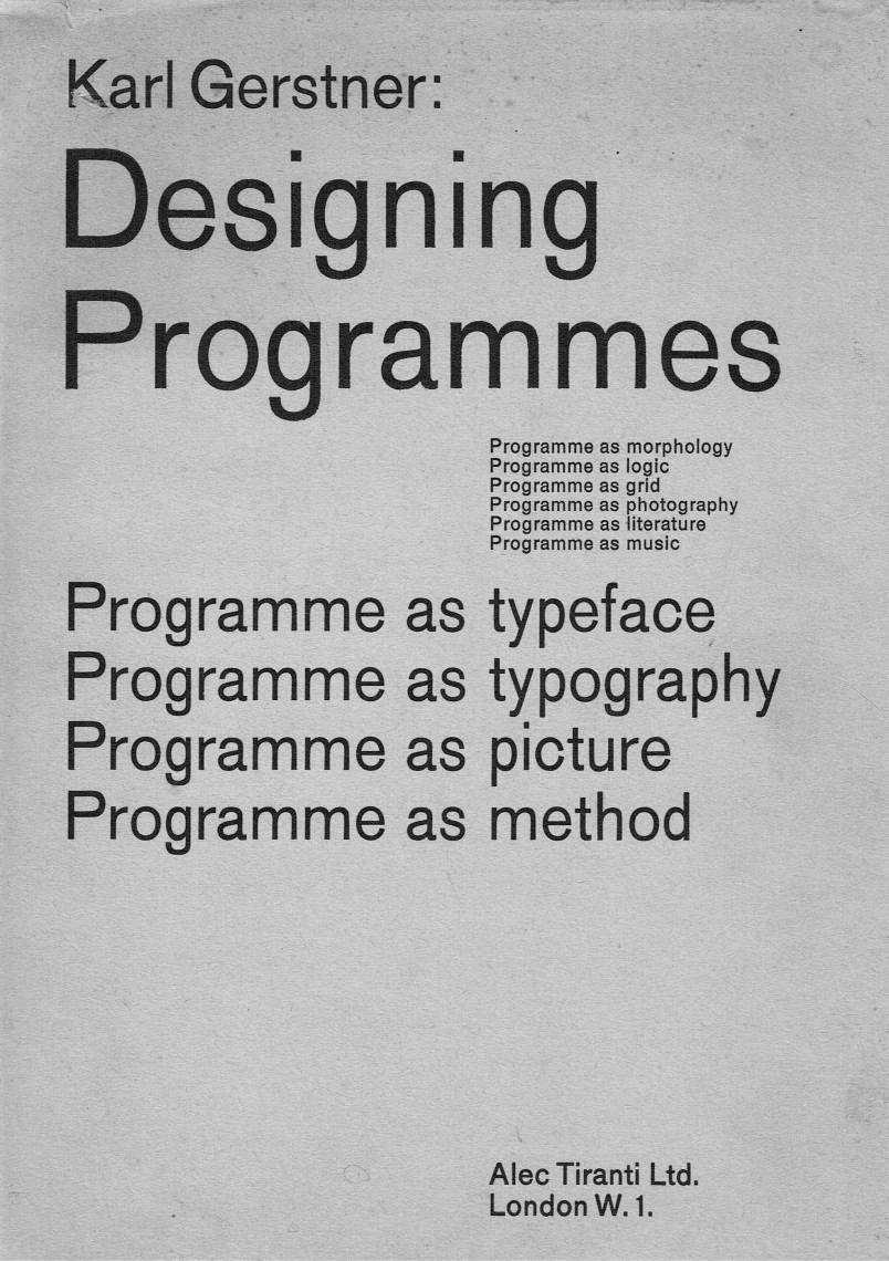
CR: We were looking at Karl Gerstner’s [I] Designing Programmes [J] (the typeface [K] is an homage to that) and noticed that enterprise-scale sites today are built in a similar way, in this case under the guide of UI kits and pattern libraries. I think we were certainly attracted to that and played up some of the logic around how elements might strictly conform to some of these conventions – both in Designing Programmes or something more familiar, like Google’s Material Design [L]. It’s a popular approach that comes with a lot of promise – greater efficiencies, more time for invention – but these systems can be brittle. Real-world inputs are unpredictable – and not necessarily in a negative way. We could not have predicted that months later, speaker photos on the event module would all align to have an inverted black bar appear over their eyes [M]. I think there’s something loose or improvisational about that – the site’s infrastructure is set up to handle a lot of content flowing through.
AA+WK: You frequently include the writings of Cedric Price and Christopher Alexander in your reading lists at the School of Art. What is your attraction to Price’s approach [N] and how is his thinking relevant to the design of digital platforms? How do his attempts to use space as a medium of information in architecture in the 1960s translate into digital culture today? Can we ask the same of Alexander’s thinking towards architecture in the 1970s?
DM: I like the humor and lightness in Cedric Price’s work and thinking, and in both of those writers, just the basic idea that things change over time and that program or society might matter more than a fixed object. That’s still a challenging idea for designers, who tend to think of themselves as making something, rather than acting as a change agent or even just a businessperson.
AA+WK: Price said that a city that doesn’t change and replace itself is a dead city. Similarly, you’ve said that the launch of a site is a minor event in its life. Now that you’ve seen it in use for about eight months, how will the YSoA site continue to evolve as a platform over time?
DM: Within the events calendar, we key each semester to a color – a visual link to the lecture posters designed by Pentagram. Those posters have a rhythm to them. They signal the arrival of a new semester and everything that comes with that. As a platform that is constantly being fed new data, this is a nice way to periodically signal the site’s change. At their core, both the Architecture and the School of Art sites can grow and mutate in the same way – and both sites have their own ways of giving authors (albeit they are different groups) a relatively unrestricted ability to evolve and expand the site.
But in some ways even more than art.yale.edu, the Architecture site is becoming a substantial tome of student work. More is being added all the time, and there are now a few hundred records. If archival works are added, this could mean evolving the interface to give users equal access to work from 1968 and 2018. It would be great to keep going back in time as easily as we go forward.
H.
I.
J.

K.
L.
M.
N.